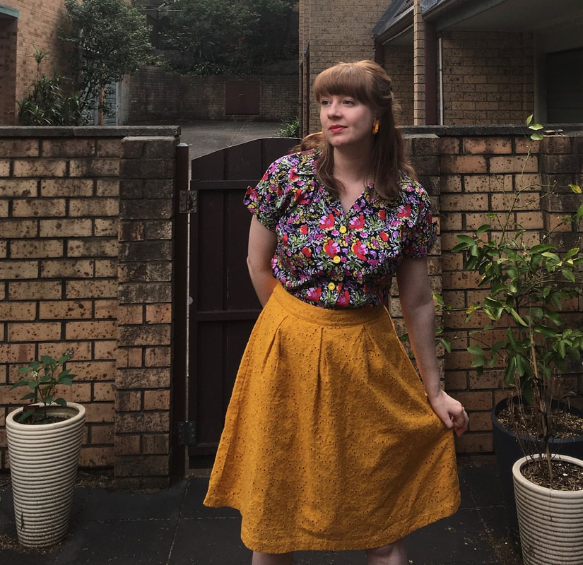
 Gosh this is bright for me. I'm not usually one to pair bright colours with other bright colours. But I think I am sort of liking this combo? Maybe? The blouse is me made from a vintage pattern, McCall 7265 that I bought on eBay a while back. I don't know the date of the pattern but I suspect late 40s / early 50s judging by the cover drawings. I made it in a 100% cotton from Spotlight in this mad floral print on a dark navy blue background. It's a kimono sleeve / cut on sleeve with a little point cuff to finish it off. I have matching yellow seam binding on the inside of the cuff which no one will ever see. But I know it matches the yellow vintage buttons on the front. Yeah, I know the yellow buttons aren't the same yellow of the skirt. But the buttons match the yellow in the shirt print! Too many yellows for me to match. Marked button placements on blouse patterns are never right for my torso. I never use them. My hot tip - try the blouse on, mark where the button should be at the bust line, and then sort of where the top button will be. Take off the blouse and then evenly space buttons from there. It's a MUCH easier method and suits my ratio better than the suggested spacings. This skirt is a recent purchase from Dangerfield. It's a cotton broderie anglais with a full lining. So... no pockets. :( But it's cute and I dig the rich colour. What do you think of the bolder colour combo? 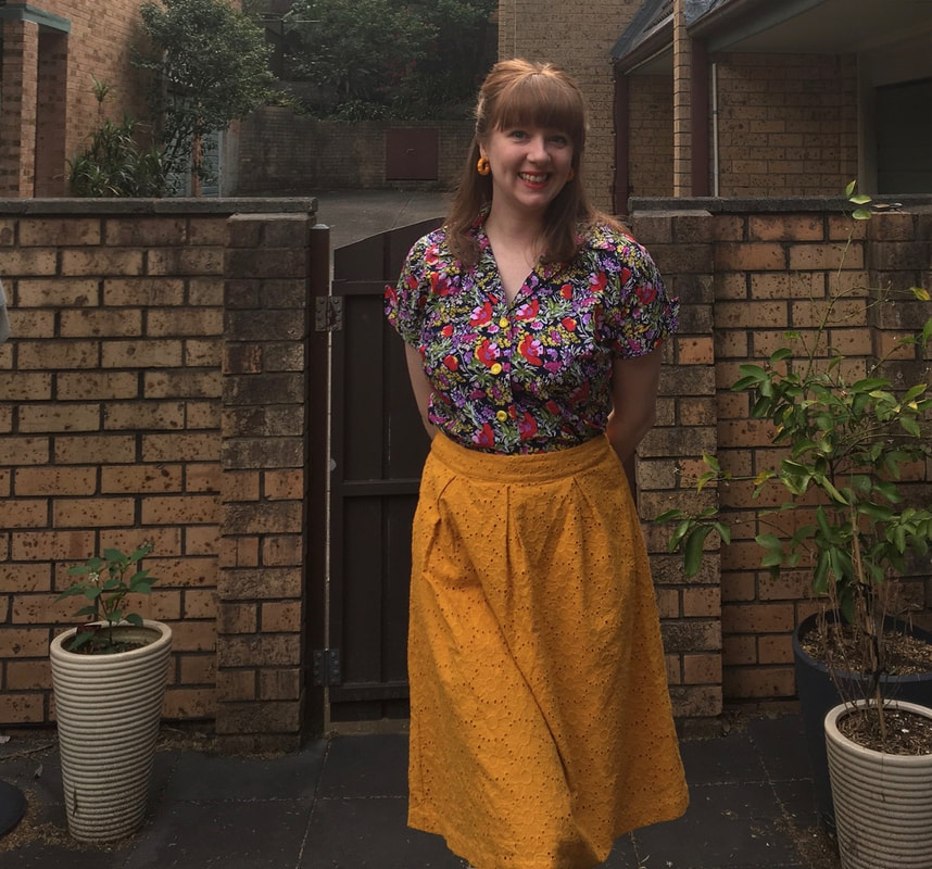 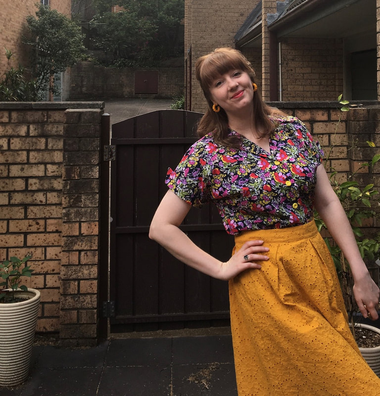 Blouse: Made by me from McCall 7265
Skirt: Dangerfield Earrings: Bow & Crossbones
0 Comments
Leave a Reply. |
AuthorKnitter. Home seamstress. Dance Teacher. Archives
April 2023
Categories
All
|
 RSS Feed
